Using picture perfect photos on your website
Photo quality REALLY matters - so when you’re putting images on your website, here are some guidelines that will enhance your brand, your website and your SEO.
And this DIY attempt is why I use professional photographers for my jewellery business!
Rule 101 for any website: Never use poor quality photos / blurry photos / dull photos - they can really ruin your credibility and leave your potential clients running for the hills (or more likely, straight to your competitors).
Designers can work magic on a website using branding and layout techniques, but starting with bad photos is never going to mean a stunning site that your clients are going to love and trust!
So what can you do with the images you already have?
Take a good hard look at the photos on your website.
Do the products look as good as they do in real life? Are they shown off in their best light?
Are the images perfectly in focus?
Are you proud of them?
Would you be impressed with them if you saw them on another website?
Do they fit your brand styling (i.e. are the colours, or the visual styling right for your business?)
Do they fit your brand values (i.e. are you a luxury brand? - if so, do your photos exude luxury? Or are you an artisanal brand? If so, do your images have an artisanal feel?
If not, it is time to look at taking better images, or booking time with a professional photographer - (see more below).
Another great idea for both you and your web visitors is to set your images up for web optimisation and fast loading, using the guidelines I’ve set out here:
File size:
Sluggish websites tend to have a lot of large images, so if you can make sure all your images are set up to streamline the user experience.
Pixel size:
Screen resolution is 72 dots per inch (dpi), so using a larger resolution is just slowing down your website and filling your web hosting space unnecessarily. If you keep your image files to 2000 pixels (px) wide max* at 72dpi, they will fit across phones, tablets, laptops and desktop screens nicely.
*1500px wide is fine for images not designed to span the whole page, - see the difference between Banner Images and On Screen Images below.
Byte size:
If each image you upload to your site is under 500kb file size, you’ll be doing yourself and your viewers a big favour. But if you can reduce them down further, to say around 100k per image, that’s even better! Think about using https://tinyjpg.com to reduce your image sizes, it’ll help page load speeds no end!
What about the images currently on your website? Are they all under 250kb file size? Are they all under 2000 pixels wide at 72dpi? If not, can you resize them down and compress them without losing image quality?
File Formats:
The two types of image files you’ll use on your website have the suffix .jpg (or jpeg) or .png. In general you’ll want to use .jpgs on your website as they are smaller in byte size than .png files. The main use of .png files are when areas of the image are transparent and need to overlay a background, such as a logo. In general, use .jpgs on your site.
Use a .jpg for most photographic images.
Naming:
Naming images for SEO will improve your search engine rankings and website traffic! A good protocol is to use lowercase text only and use - dashes instead of spaces. Naming your images with relevant search words will can mean you’ll get additional website traffic from Google image searches. The image of me above, was originally called EA5A7161.jpg, but I renamed it jade-thomas-squarespace-designer.jpg when I opened and resized it.
Squarespace websites allow you to rename your images once you’ve uploaded them too.
Most of the images on your website will fall into these two categories:
Banner Images
A banner image sits in the background with text or content on top.
Size and orientation:
Banners tend to be landscape orientation (horizontal), and 2000px wide at 72(dpi) is ideal. You can use a portrait (vertical) image and crop it down to landscape, but make sure it is large enough in the first place to look good at 2000px wide.
Colour and pattern:
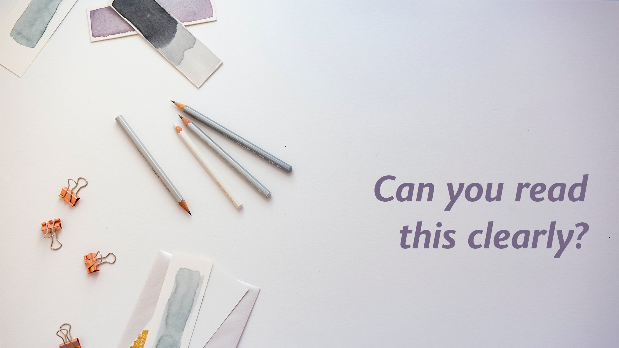
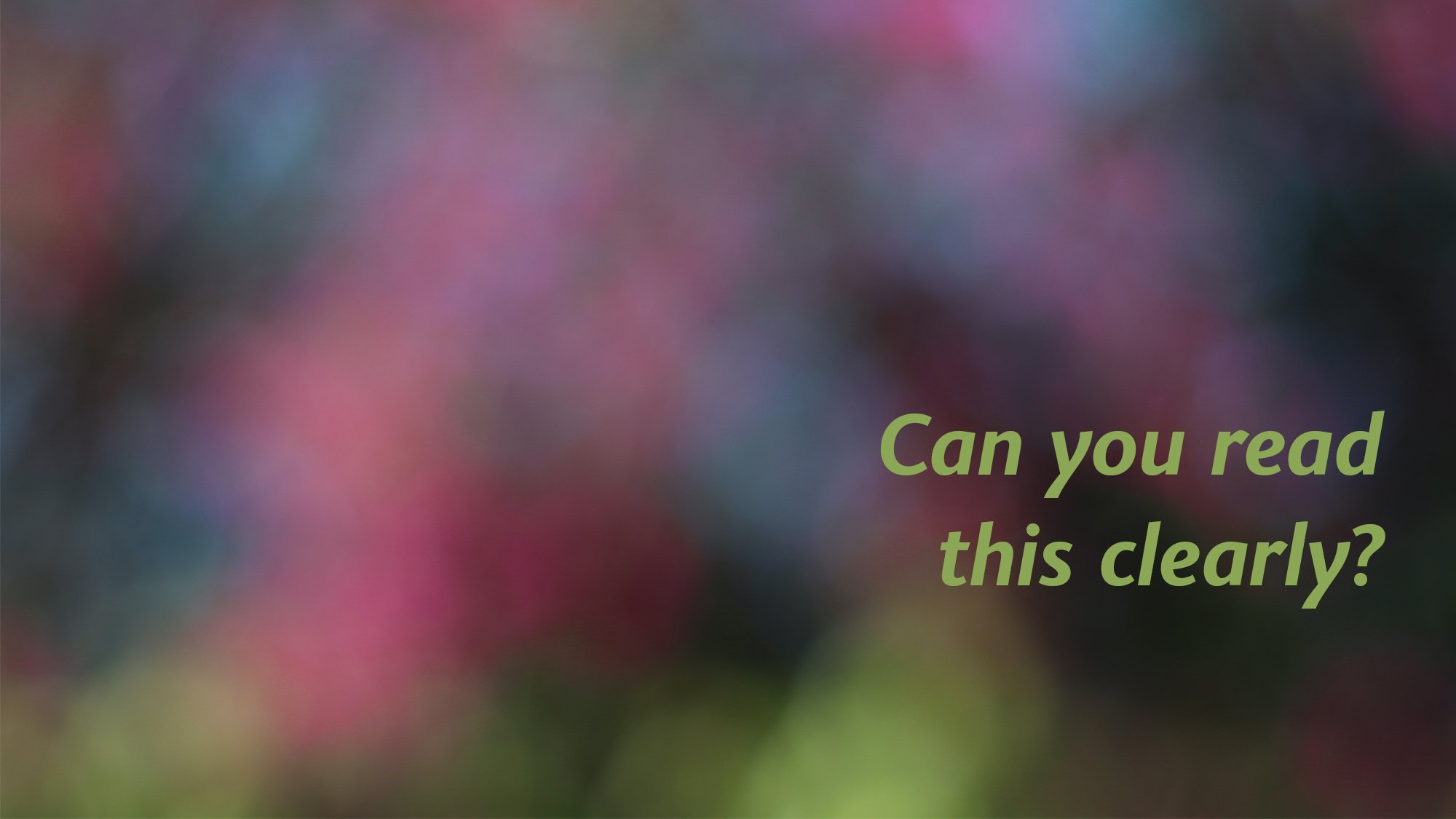
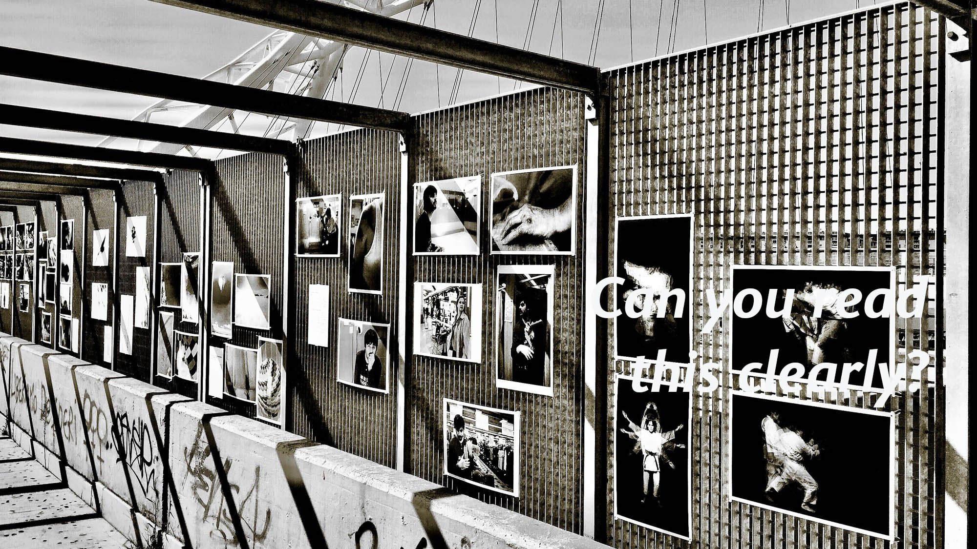
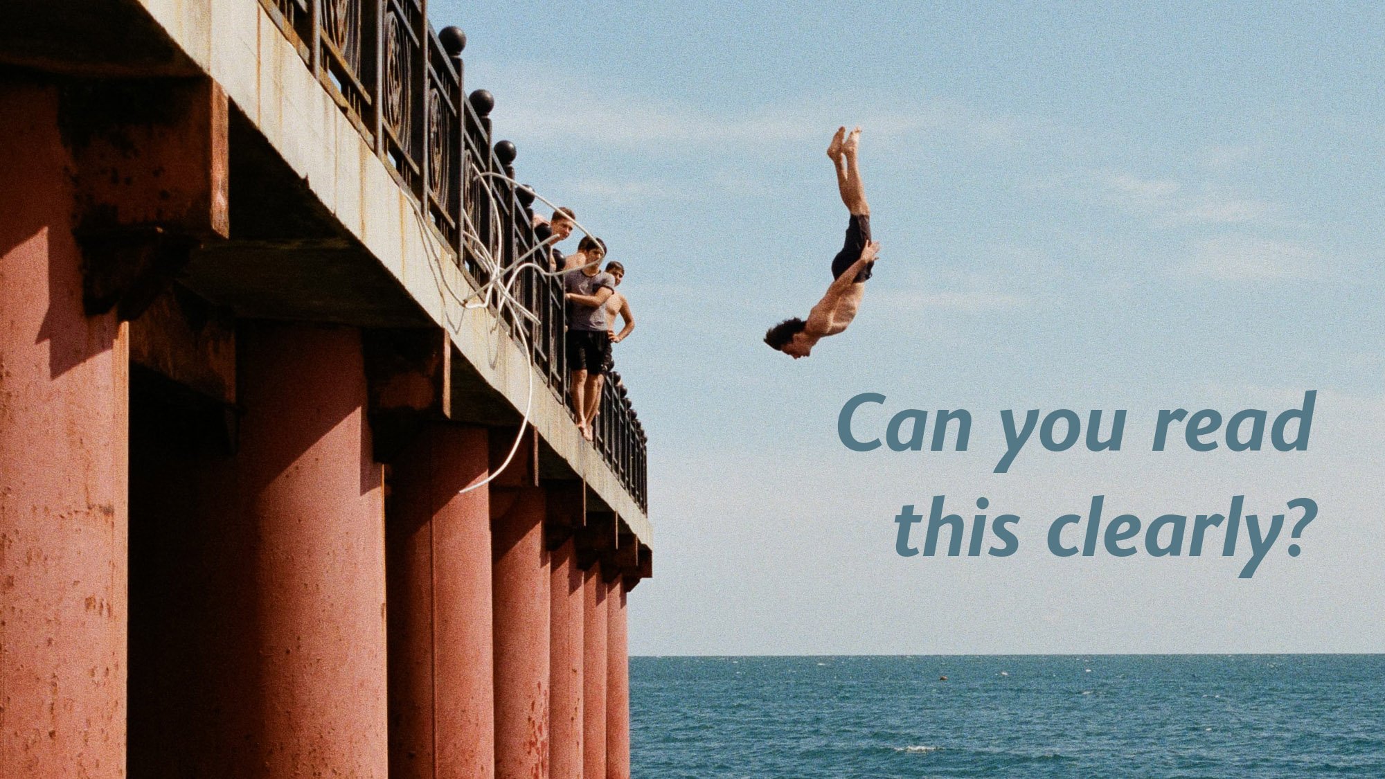
You want your text or button to stand out from the banner image or video, so choosing one that isn’t too busy, or has plenty of plain background is key. Text over someone’s face or over the focal point of the image/video never looks good, so choose one with lots of space for overlaying text. Remember that websites are responsive, meaning things move around to suit the device they are being viewed on, so you need to test that your banner image works well on your phone, tablet, laptop and computer. You then want to choose a text colour that is clearly visible over the banner. Blurred images or images with plain areas are perfect.
Here are some banner examples, good and bad:


On page Images
These are all the other images on your site, such as product, people or brand photos. 1500px wide at 72dpi is the perfect size to save these at. Keep in mind the file size and naming protocols mentioned above.
What if you’re yet to choose your images?
Well you have options! It is definitely worth trying to take some photos yourself - we all have amazing camera tech built into our phones, and with some lights and maybe a lightbox, we can take some pretty good product photos, but when you look at the results, be honest with yourself - are they right for your ideal client and your price-point - if so, great! If not, using a professional product photographer will make a massive difference!
The same applies for lifestyle or people photos, booking a professional photographer will give you some amazing results!
Try to avoid hiding behind cheesy stock images that EVERYONE else uses too!
… Nooo, step away from the cheese and be visually authentic to your audience!
Yes, but I need a photo of a giraffe, and there aren’t too many roaming around in Buckingham!
If you’re looking for aspirational images for your website, a really good place to look is on stock photography websites, where the images are licensed for commercial use. The first website I’d recommend is unsplash.com - a brilliant site with free, (yes free!) images that you can legally use online and offline. If you can’t find what you’re looking for there, royalty free photos, illustrations and videos can be purchased at reasonable prices from istockphoto.com - there are plenty more royalty free image sites too! Just tread carefully and be authentic with your imagery. We all know those shiny call-centre images aren’t real and viewers will get the feeling that the rest of your website is deceiving us too.
A final note on ‘Nicked off Google’ Images
All photos, videos, diagrams, infographics and images you’ll find online are owned by someone. So simply finding a photo on google will not mean you have permission to use it on your site. If the owners find you using their image, it can get messy, and you may get fined. So with a wealth of other ways to find amazing images, just steer clear of nabbing them off Google!
Hopefully this has given you the confidence to audit the images you’re using, streamline them for web optimisation, and if you’re not 100% happy - outsource! I know some amazing brand, product and lifestyle photographers if you are looking for recommendations!
